Prox
Designed the entire product as founding designer, from blank canvas to closed beta. Helped raise $800k. Then COVID happened.

This was 2019. I was the only designer, and I was figuring out things nobody had really figured out yet: how to make a structured video call feel better than an in-person conversation, how to give 15 minutes of paid access to an expert a shape that justified the price. Video calls were not a mainstream work tool yet. Zoom fatigue wasn't a phrase. The problems we were solving became widely understood only after a global pandemic made them everyone's daily reality.
The work looks dated now. The UI has the texture of 2019. But the product decisions underneath it were real, and some of them held up under actual user testing. This is where I learned what it means to be the only designer in the room when the room includes investors, engineers, and paying users.
The Company
Prox was a 1:1 video platform connecting experts and learners through structured, paid conversations. The premise: high-profile professionals, creators, and entrepreneurs were impossible to reach directly. Their audience could watch a YouTube stream with 10,000 other people, but getting a real answer to a real question was not something those platforms were built to do.
Prox gave experts a complete infrastructure: a personalized landing page, a calendar, payment processing, a booking system, and a structured video session. For learners, it was direct access to people who were otherwise unreachable. I joined as the founding designer and was the only designer on the team throughout the company's life.
The 1:1 session experience, the core of everything Prox was built around.
The Problems
Three problems shaped the product. Experts had no direct monetization channel outside of ad-dependent platforms. Learners had no way to have a real conversation with someone they admired or wanted to learn from. And when those conversations did happen, through Facetime or Skype or a random Zoom link, they had no structure, no agenda, and often ended without the learner getting what they came for.
The third problem was the one that most shaped the design work. A 15-minute conversation with someone charging $1,200 an hour is worth nothing if it goes off the rails in the first 5 minutes. Structure was not a nice-to-have. It was the product.
Learner persona research , Gen Z and millennial users seeking direct access to experts.
The Booking Flow
The booking flow was the first thing a learner experienced, and it needed to do a lot: land on a creator's page, understand the value proposition, pick a time, set up a session, and feel ready for the conversation ahead. Every step was a potential drop-off.
I started with a detailed session request form that asked learners to select duration, choose topics, and add specific questions before submitting. The idea was that a structured request would produce a more structured session. Testing showed the opposite.
- Landing Page
Each expert got a personalized URL they could share through their social channels. Early versions embedded a calendar directly on the landing page, which created a conflict with the primary CTA. The final version removed the calendar from this surface entirely and focused on a single action: book a session. Clean, responsive, and fast to set up.
Final expert landing page , one CTA, no calendar conflict.
- Selecting a Time
Simple on purpose. Only available slots were shown. No friction, no decision fatigue. The calendar surfaced at this step instead of the landing page, where it made logical sense in the flow and didn't compete with anything.
Time selection , available slots only, no visual noise.
- The Request Form, Before Research
The first version asked learners to choose a session duration, select topics, and add specific questions before submitting. Testing quotes were direct: "This is tiring," "I hope I can come back to this screen," "Can I just book and fill these out later?" Users could not establish a clear relationship between topics and questions. The form created friction before the value was established.
Original request form , too much friction before booking.
- The Request Form, After Research
The research finding drove a real product decision: simplify to a single 15-minute session length, ask only for a time and a custom message, and defer all agenda-setting to after the booking was confirmed. This removed the friction entirely. The agenda would be built inside the session management view, where context made it meaningful rather than arbitrary.
Simplified request form after research: pick a time, add a message, done.
Booking flow on desktop and mobile.
Sessions and Agenda
The Sessions page was where both experts and learners managed their upcoming and past engagements. It needed to surface the right actions clearly: launch a session, set an agenda, message the other party, or respond to a pending request.
The session row was a UI component that carried a lot of weight. It needed to communicate who, when, how much, and what to do, all without requiring the user to open a detail view to understand the situation.
Session row component iterations , tested with a five-second test to find the clearest information hierarchy.
Expert-side session management , incoming requests and session queue.
Agenda management on mobile , setting up questions before a session.
The Video Experience
The motto was better than in person. That sounds like marketing language but it was actually a design constraint. A 15-minute paid conversation needed to be more focused, more structured, and more productive than a spontaneous call. The video screen was where that promise either held or fell apart.
The challenge was showing two camera feeds, an agenda, a chat, and session controls simultaneously without making the screen feel like a dashboard. Everything competed for attention, and the person across the camera was supposed to win.
Early sketches , two-section layout with camera feeds and agenda space.
Early wireframe iterations , working through navigation and information distribution.
Mid-process exploration , dark mode to shift attention toward the video feed.
Final video engagement screen , camera feeds, agenda, and session controls.
Agenda in session , questions highlighted as the conversation progresses.
The Lobby
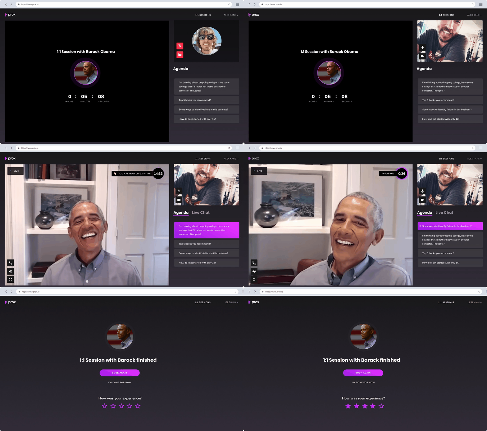
The lobby is the screen a user sees in the 10 minutes before a session starts. It needed to do several things at once: surface the agenda so it could be reviewed, let users test their mic and camera, and create anticipation without creating anxiety. You paid $150 for 15 minutes with someone. You want to feel ready.
Three iterations got the lobby to a place where it actually accomplished that. The early versions had unclear status communication and controls that felt premature. The final version led with the other person's presence and a countdown, with mic and camera controls accessible but not foregrounded.
- V1
Timer as countdown, unclear status labels ("Now" vs "In Queue"), control icons that felt out of place this early in the flow. No strong visual cue about who the session was with.
Lobby V1 , unclear status, premature controls.
- V2
Proper timer introduced, expert profile photo added, mic and camera testing moved here. The audio config bar felt out of place since it disappeared once the session started. Questions simplified into a single block.
Lobby V2 , better hierarchy, still some unresolved controls.
- V3
The final version created genuine anticipation. The expert's presence was the dominant element. Mic and camera were off by default (users had expressed that preference in testing) with controls accessible but not in the way. "Agenda" replaced "Questions" based on the same terminology research that informed the booking flow.
Lobby V3 , anticipation-first layout, controls out of the way.
Timers and Engagement Mechanics
A 15-minute session is short. The UI needed to communicate time without creating pressure that derailed the conversation. Two timer conventions were designed to handle this.
The first was a 60-second ice-breaking stage at the start, explicitly labeled. The naming acknowledged the awkwardness and gave both parties permission to ease in. The second was a gentle time-check at minute 14, surfaced smoothly rather than as an alarm. No interruption, just awareness.
Post-session rebooking screen and retention mechanics.
User Testing
The original plan was to observe the first live sessions directly. COVID made that impossible. Instead, 11 remote interviews were conducted immediately after sessions completed, while the experience was still fresh.
Key findings: 5 of 9 learners did not notice the agenda was interactive. Conversations flowed well despite this, largely because the experts were skilled facilitators. The non-verbal behavior of the agenda was validated: users naturally implied moving to the next question without clicking anything, and the highlighting convention matched that behavior.
User testing session recording , post-session interviews with beta participants.
1:Many and Future Vision
The 1:1 format validated the core product. The immediate next step was a 1:Many format, capped at 12 participants, where a group with a shared interest could book time with an expert together. More accessible for learners, significantly more profitable for experts.
The standout feature was the question queue with voting. In a room of 12 people, democratic question selection replaced the expert having to manage the conversation manually. The 'on stage' mechanic took it further: when a voted question was selected, the learner who asked it came on screen. The auditorium moment, when someone from the crowd is handed the mic.
1:Many question queue with voting mechanic.
Beta Results
The closed beta launched in April 2020 with two expert ambassadors, each with an established following and a consulting rate above $1,200 an hour. A 15-minute Prox session was a meaningfully lower barrier to access.
51% of learners rebooked after their first session. That was the number that mattered: it meant the product delivered enough value to pay for again.
Raised before the video session feature shipped. The raise was built on the calendaring, landing pages, and marketplace prototype, and a thesis the investors bought before COVID changed the context entirely.
Beta launch metrics , acquisition and conversion data from April to May 2020.
Top earners view during the beta period.
What We Learned
16 sessions had no agenda interactions at all, which pointed to a discoverability problem that needed to be addressed. 29 paid users went into sessions without setting up an agenda. 34 support requests came in about payment and scheduling logistics, a clear signal that the product flow was not self-explanatory enough in those areas.
3 expert no-shows and 9 learner no-shows pointed to a gap in commitment mechanics. The platform was collecting money but not yet creating the kind of mutual accountability that would make no-shows feel costly to both parties.
Reflection
Prox raised an $800k seed round. The product shipped, ran a real beta, and generated real revenue. Then COVID hit, and the world it was built for changed faster than the company could adapt. We shut down in early 2020.
We were building infrastructure for video-based expert access before anyone thought they needed it. Six months after we shut down, remote video was everyone's daily reality and the market we had been targeting exploded. That's a difficult thing to sit with.
What I took from Prox: how to make product decisions under real constraints, how to run research that actually changed what shipped, and what it feels like to be the only designer in a room with investors, engineers, and paying users all wanting different things. That education had a price tag attached to it.