Studio 2.0 Design System
An 8-week collaborative sprint to build a scalable, mobile-first design system that Patreon's disjointed UI and set the visual foundation for the platform's rebrand.

Eight weeks, three designers from different departments, no prior shared system to build from. Studio 2.0 was Patreon's first real attempt at a visual language, built during a period when the product strategy had shifted significantly but the UI hadn't caught up. My contribution came from the Creator Tools side: the design explorations, the shape system, and the component architecture that became the foundation for the 2.0 migration. The system shipped to engineering in January 2021. I didn't see it fully rolled out across the live product, restructuring ended my time at Patreon shortly after. The work held up well enough to be used as the blueprint for what came next.
The Result
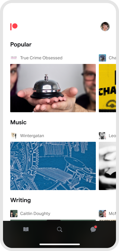
Studio 2.0 final product intro and visual language overview.
Our mobile-first Design System was named Studio 2.0. We built it as a dedicated task force of three designers representing different departments: myself from Creator Tools, Grace from Fan & Patron Experience, and Mary from Growth.
It was an intense 8-week process that included deep collaboration, generative brainstorming, heads-down solo explorations, and rigorous stress-testing, culminating in an engineering implementation and rollout plan alongside new platform features.
Why Build a New Design System?
We didn't have one. Patreon's product strategy had shifted from being known as the 'Kickstarter for musicians' to a massive, content-first community platform fostering cross-collaboration, creativity, and passion.
Patreon urgently needed a common language to align product, engineering, marketing, and legal,not a disjointed combination of legacy UI components. Tech debt had accumulated across buttons, labels, navigation paradigms, and spacing scales. Truth be told, Patreon was long overdue for a complete visual and structural rebrand.
Early Explorations
We kicked off by brainstorming with a cross-functional group of 8+ people across design, product, and marketing. We grouped assets into buckets of categories and distinct styles to define our core themes (e.g., Creator tools needing to feel robust and professional, while Patron spaces needed to feel like a cozy, exclusive club).
From there, we diverged. Designers were given total freedom to design 'north star' beautiful interfaces. We shared these within the team, iterating and diving deeper into ideas and conventions.
Initial moodboards and brand inspiration gathering.
Exploration: Premium & Editorial.
Exploration: Streamlining & Shapes.
Exploration: Art Mosaics.
Exploration: Simpler UIs.
Team Convergence
After our individual divergence phases, the task force focused heavily on convergence. We aligned on concepts, typography, the balance of Patreon colors vs. Creator brand colors, and established our core visual treatments.
Creating a library of gradients and textures.
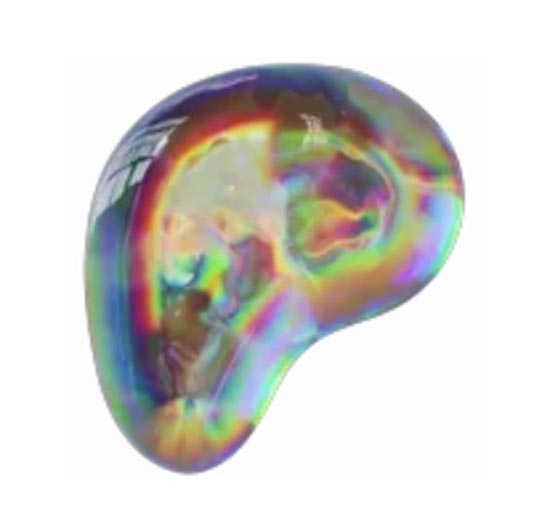
Shapes as structural meaning.
Defining 'Magical Moments.'
The Studio 2.0 Library
Studio 2.0 became the single source of truth for all design elements used across Patreon, enabling teams to build efficiently and consistently. We structured the library into four core tiers:
Foundations: Visual attributes like brand elements, color, typography, layout, and spacing.
Components: Reusable UI building blocks created from foundations.
Patterns: Solutions to known business cases, focusing on the problem being solved rather than just UI behavior.
Views: Full page or screen templates reused throughout the application.
A sample of the resulting Studio 2.0 Component Library.
Implementation & Rollout
By January 2021, Studio 2.0 was rigorously documented for product and engineering. The immediate next step was defining implementation phases, coordinating the migration to the new system in parallel with shipping Patreon's broader structural changes.
Sequencing and rollout strategy for migration.
Desktop Creator Tools interface preview, re-skinned utilizing Studio 2.0.
A sneak preview of our ongoing iteration process focused on our core product surfaces.
Impact & Reflections
Studio 2.0 handed over to engineering in January 2021 with a full rollout plan and executive buy-in. No conversion metrics to point to. What it produced was a shared design language, a four-tier component library, and an implementation plan the team could execute without me.